
Agency brand refresher and punchy website
Re-working an activation agency’s website and branding to match their evolved business positioning.
The project:
A branding and website refresher for activations agency Jawbone. Jawbone initially reached out to refresh their old static site. However, Jawbone had recently completed an internal brand strategy and positioning workshop so instead I pitched a mini branding and messaging update alongside ground-up website build.
Deliverables:
A mini rebrand (colour + typeface + tone) and a website (redesign + build + deploy) on WordPress. After wrapping up the project, the client also requested social media templates, pitch deck templates, print ads, email signatures and a few more odds and ends which I was more than happy to tac-on as additional projects.
Role:
Art direction, graphic and digital design, branding, motion graphics, frontend development.
Position: Freelance, sole designer and technical.
Jawbone needed to outwardly represent their recent inner brand positioning changes, and build trust and authority with current and new clients looking to reach a young, urban market. After assessing the existing website, messaging and branding, we agreed on a mini branding update, complete with a ground-up website redesign and rebuild.
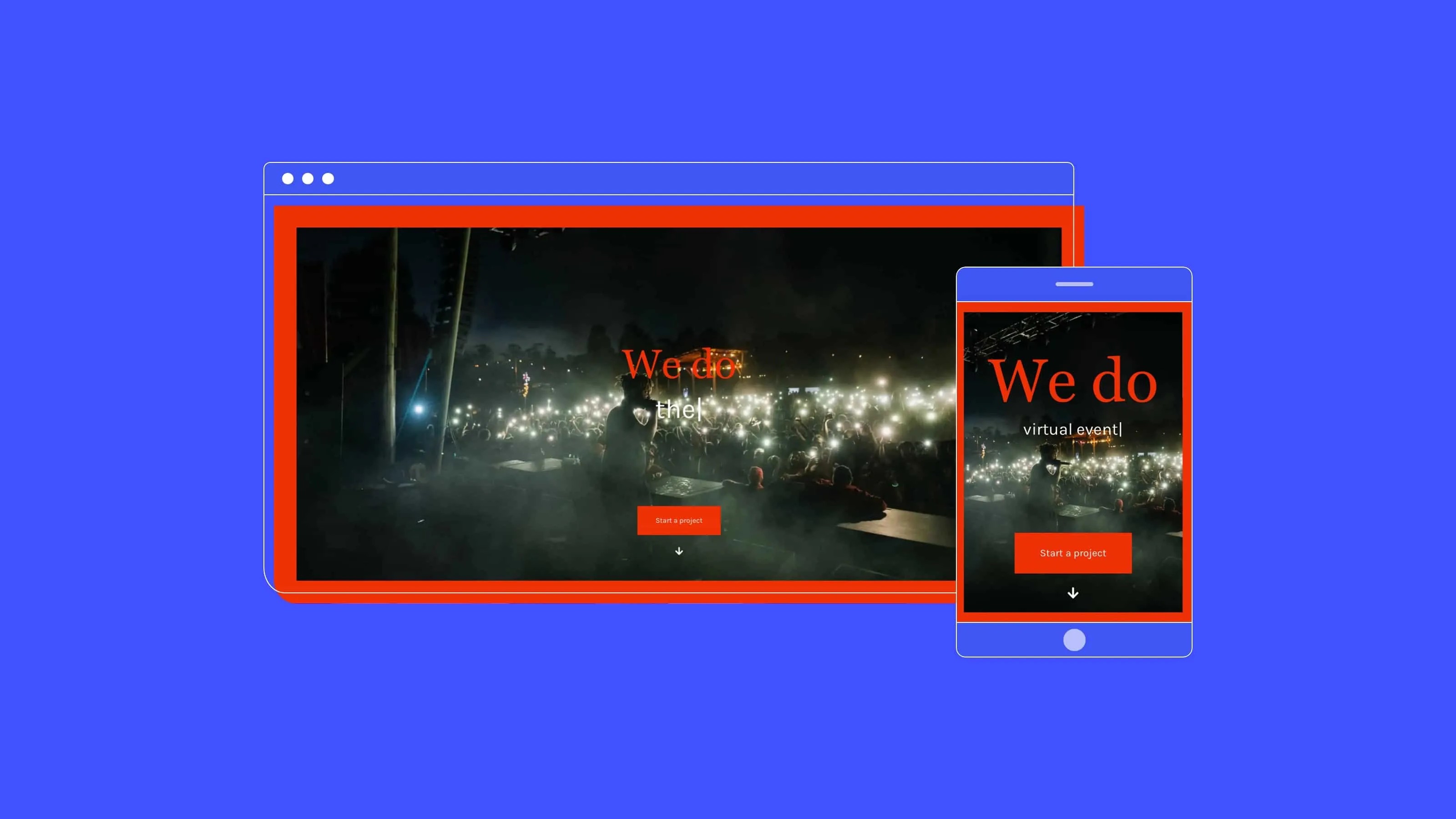
With room to tailor-make an optimised solution for Jawbone, I set about wire-framing simplified page structures, messaging and user flows. Along with freelance brand architect, Zak Venter, we connected with the founders to hear more about the business, how they work, who they are as people, and what the website needs to achieve.
A key insight was that new clients preferred interacting with a founder directly and that most 'conversions' happened this way. This human contact point was integral in driving the primary website objective: getting clients to (1) trust the brand enough to (2) contact a founder directly.
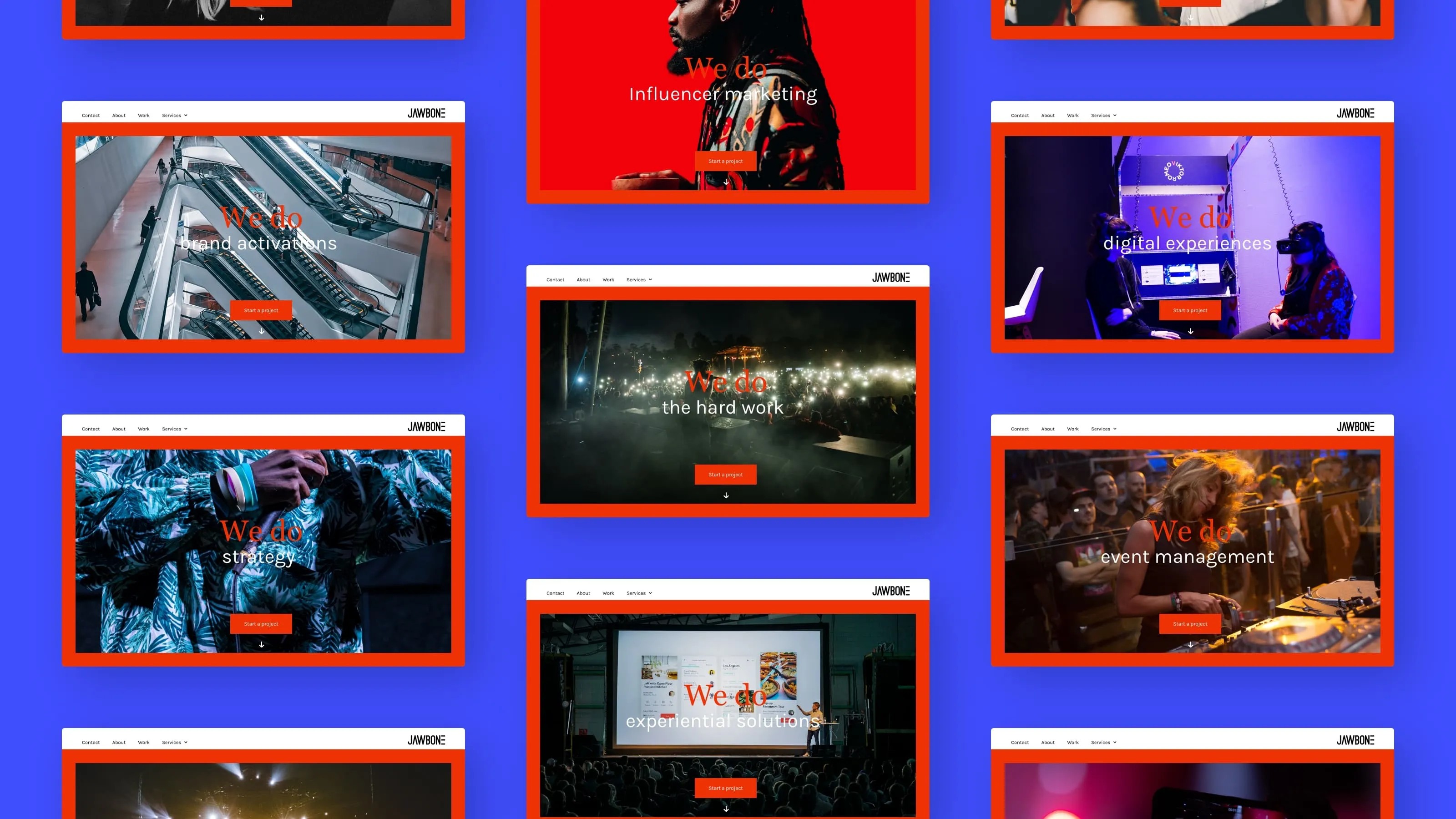
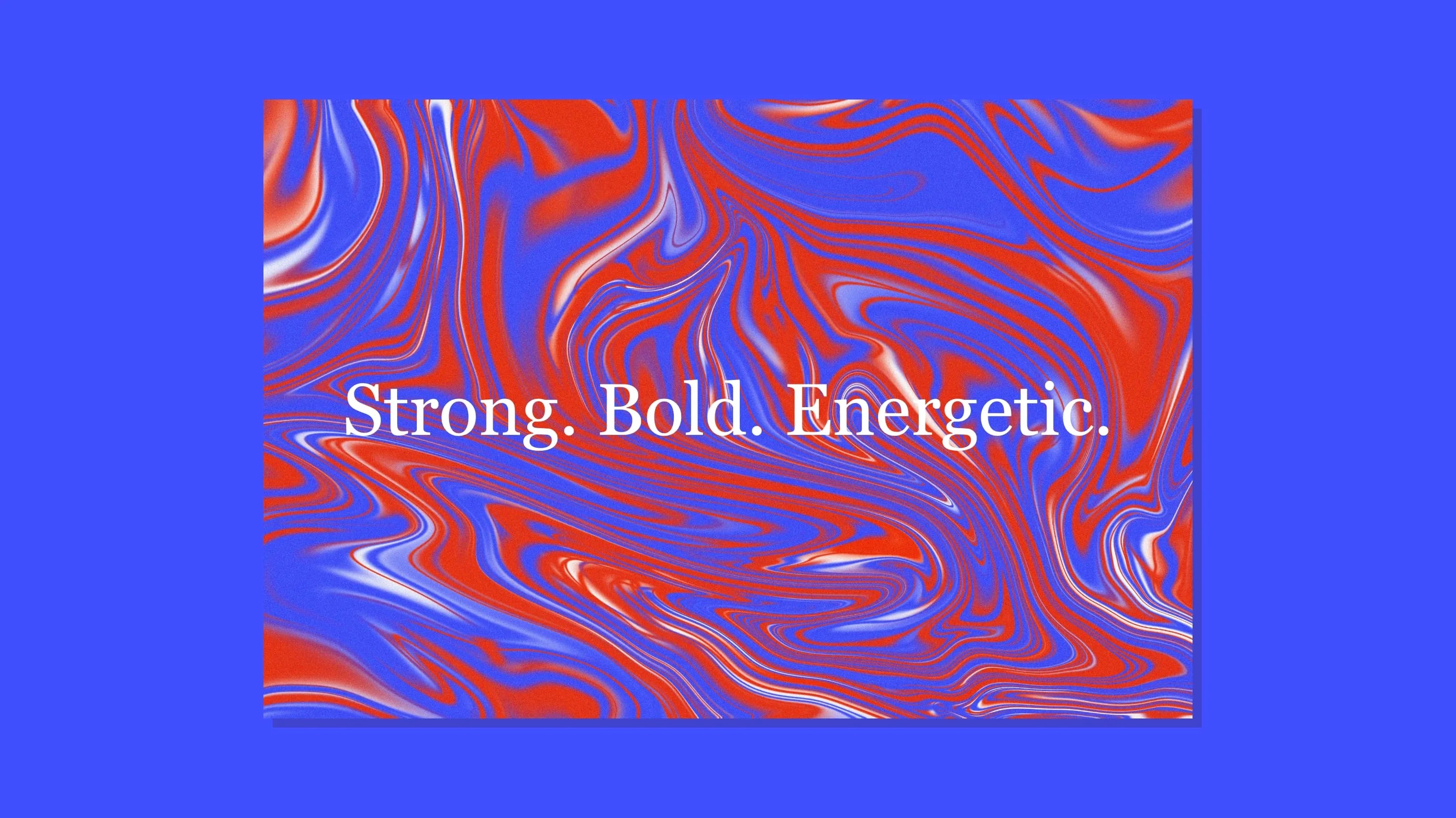
My role as both creative and technical on this project was to conceptualise, design, build and deploy the new website and mini re-brand. The rebrand included a new font-family set, minor logo tweaks, a fresh colour palette, and a bolder brand messaging style with the founders' personalities baked-in.
Website design and prototyping were completed in Adobe XD, video and animations in After Effects, and the WordPress site was built using popular visual builder Elementor Pro. Deployed to the client's servers in South Africa in January 2021.


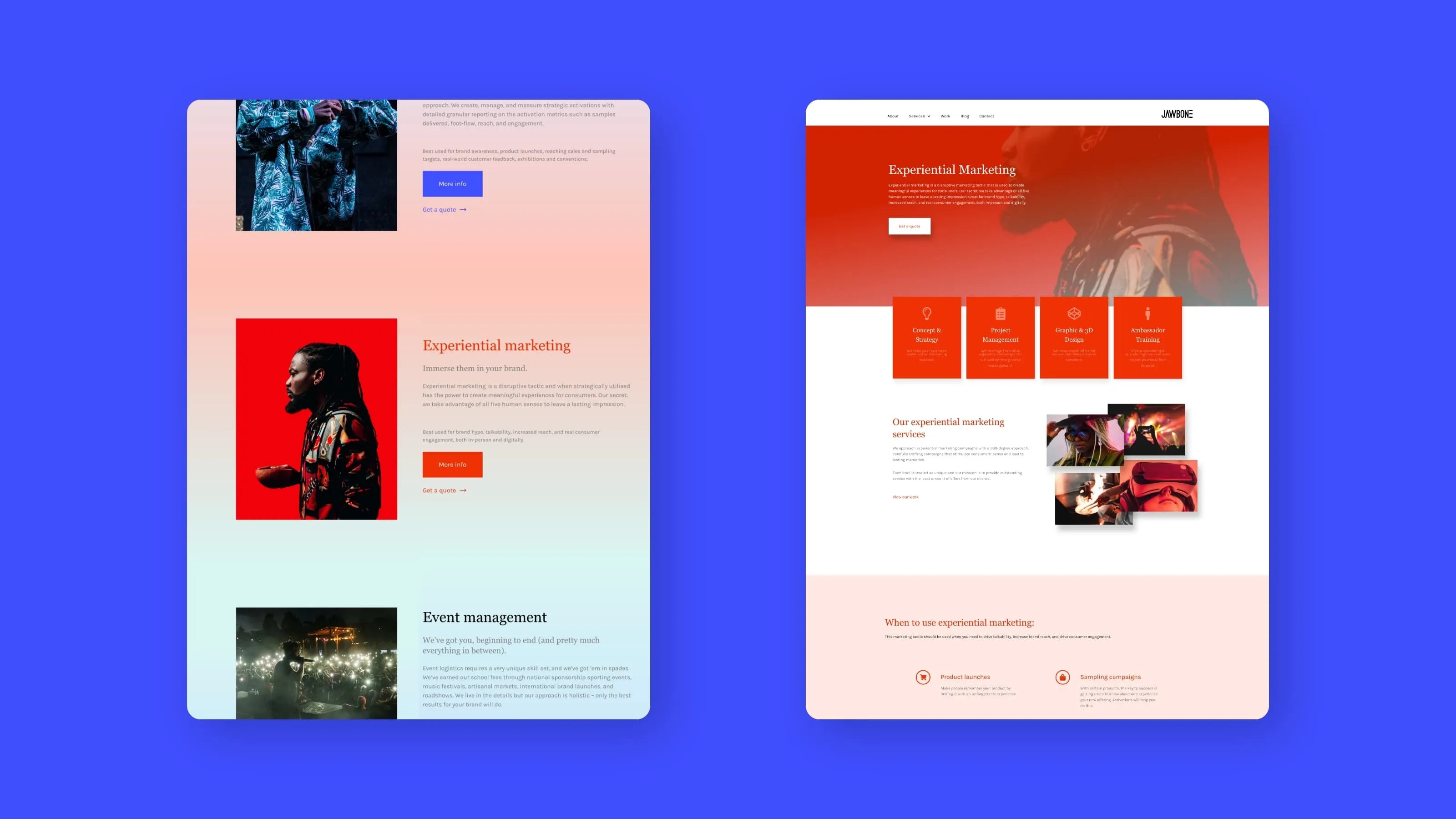
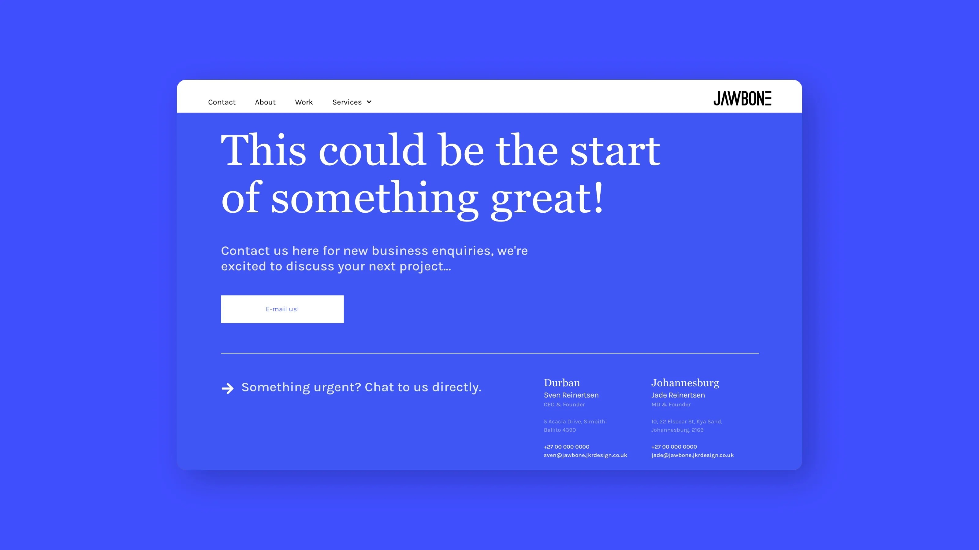
After wrapping up the project, the client also requested editable social media templates, pitch deck templates, print ads, email signatures and a few more odds and ends which I was more than happy to tac-on as separate projects. It was great to work with an eager client to deliver a consistent recognisable aesthetic across all channels.


